Harvest & Hearth Supply Co.
Concept website for a food distributor
A made-up foodservice distributor, and the website I would want it to have. I wanted to see how polished and calm a site could feel for something as unglamorous as getting produce to a kitchen on time.
Why this project
Chefs and purchasers are short on time. They need to know the food is fresh, the truck is coming, and the invoice will be right. Most distributor sites show a photo of tomatoes and a phone number.
I wanted the site to show how the work actually goes: placing an order, following a truck, checking a temperature log. I kept the design plain on purpose, so those moments are what you notice.
The rules I set
- One easing curve for every animation.
cubic-bezier(.25, 1, .5, 1)arrives fast and settles. Nothing bounces. - Eight font sizes and three weights. The first draft had 18 sizes. I only noticed when I counted.
- Three corner radii (6, 10 and 16px), one card style, and 44px buttons. The big animated Reorder button is the only exception.
- SF Symbols for every icon.
Color
I picked five colors. Muted Olive does most of the work, Dark Spruce is for small text and details, and Prussian Blue stands in for black.
White text on olive is too faint (about 2:1), so the olive buttons use Prussian Blue text instead (about 8:1). Orange only shows up on the charts, where it means something costs more.
What I like in it
- The logo. About 500 dots swarm into an H, shimmer, turn into a small globe and drift back. It plays once when the page loads, and again if you hover it.
- The delivery counter in the hero. It rolls up like an odometer, blurs when the digits are moving fast, then keeps ticking.
- The gradient behind it. It is a WebGL shader based on Alex Harri's write-up of flowing gradients. I had to retune it for a taller space.
- The six feature steps. The visual stays pinned while the text scrolls past and swaps it. On phones, each visual sits under its own text instead.
- The traceability card. It follows a case of tomatoes from the field to the kitchen door.
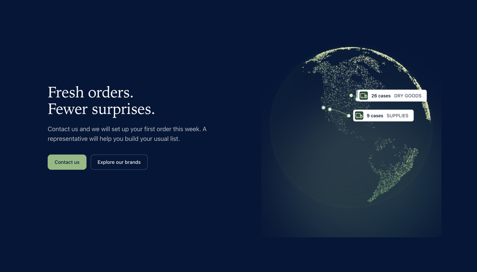
- The globe at the bottom, with delivery routes running between hubs.
What I changed after reviewing it
When the first version was done, I went through it the way a stranger would. These were the biggest fixes.
| Problem | Fix |
|---|---|
| Everything was moving at once | The hero now has one moving thing, the counter. I removed the floating cards, the looping toast and the pointer parallax, and slowed the gradient down. |
| Too many buttons | There were four labels for two actions. Now there is one: Contact us. |
| Phones lost the best parts | The visuals now show up under each step on small screens. |
| Sizes and corners drifted | I cut 18 font sizes down to eight, set three corner radii and one card style. |
| Sourcing was buried | It now comes right after the numbers, with the traceability card to back it up. |
What's next
To test
Try it on real phones and in more browsers. Show it to a chef or a purchaser and ask what they would actually trust.
To fix
Swap the made-up numbers, producers and routes for real ones, and add photos where they help.
Credits
Harvest & Hearth, its brands (Hearthware and Standard & Table), the producers, the numbers and the customers are all made up, and there are no real company logos in it. The flowing gradient is adapted from Alex Harri's article "A flowing WebGL gradient, deconstructed". I built the prototype with Claude Code.
Selected Works